
If you’re looking for the best food photography backdrops to elevate your styling and create scroll-stopping images, you’re in the right place. As a professional food photographer and educator, I’ve worked with just about every kind of surface — from DIY disasters to high-end custom builds. In this post, I’m sharing my go-to backdrops for food and product photography: the ones I actually use in my shoots, trust in client work, and recommend to my students again and again. Whether you’re shooting flat lays, moody scenes, or light-and-airy setups, these surfaces deliver major visual impact without distracting from your subject.
MY FAVORITE LIGHT OPTIONS:
Maeve. This gorgeous gal, along with Odette below, is easily my first choice for a light, warm, elegant and simply GORGEOUS backdrop. It's a stunner.


Simone. This is the one you want when you need the look of Carrara marble. Perfect for shooting baked goods or simply when you need a bright, clean look.


Echo. When I want something light, soft and neutral, Echo is the first backdrop I choose. The design is light gray watercolor and the way it photographs is a DREAM.

Otis. When you want a light gray backdrop that has great texture, Otis is your guy. It's also a great option for cool, wintery-themed shoots.


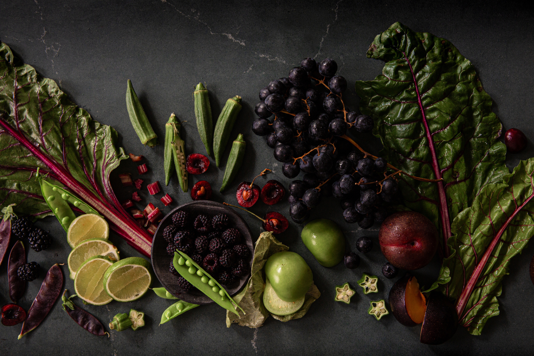
Coal. Dark, rich and subtly textured, Coal is a stunner for your dark and moody images. Note: Coal has blueish undertones-- it's not a straight charcoal color.

Bruno. Another customer favorite! Beautiful option when you styling a darker scene and want a warm option.

Zealand. When customers ask for backdrop recommendations, 9 times out of 10 I recommend Zealand. It's not only one of my very favorite surfaces, it's also a favorite of my students and my clients. Seriously. It's that beautiful.

Luca. I could wax poetic about this backdrop for days. It's featured in a bunch of our ads and I regularly get emails from people, asking which surface it is. It's a gorgeous dark, green stone that has kind of an old-world vibe and photographs like a dream.

Nova. This dark teal surface is a lovely option when you want dark but you also want color that isn't over-the-top bold.

Saffron. Imagine using a piece of gorgeous, richly toned leather as a photography surface. That's what Saffron is like. 😊


Simon. Simon is a crowd favorite for a reason — it looks like real poured concrete, but with just enough refinement to elevate any scene. It’s got that “editorial kitchen counter” vibe that works with rustic, modern, or bold colors. Whether you’re shooting messy prep moments or final hero shots, Simon just gets it.


MY FAVORITE WOOD OPTIONS:


Sophia. This backdrop is a STUNNER. I don't know how else to describe her glowy, gorgeous, almost ethereal beauty but she is MAGICAL. Without fail, one of my students will end up ordering Sophia after using her at a workshop...she is that special.

So, that's the list! It's always evolving, of course, but these backdrops are the ones I return to over and over again.
Happy creating!
Leave a comment